Analysis
Technical Analysis Basics
Charts do not predict. They organise information about supply, demand and participation so decisions can be made consistently.
By Financial Markets Research Team 8 min read
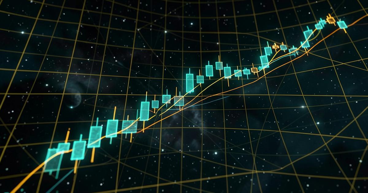
Every chart is a record of transactions: agreements between buyers and sellers at specific prices and times. Technical analysis is the practice of summarising that record so a trader can act consistently. Used well, it is a framework for organising uncertainty. Used badly, it is pattern-matching in noise.
Reading a candlestick
Each candle encodes four values: open, high, low and close. The body shows the distance between open and close; the wicks show rejected extremes. A long upper wick means buyers pushed price higher and could not hold it. A narrow body after a strong run suggests indecision. Individual candles mean little; sequences in context mean more.
Trend structure
The simplest structural definition remains the most useful: an uptrend makes higher highs and higher lows, a downtrend makes lower highs and lower lows, and anything else is a range. Defining trend structurally rather than visually removes a surprising amount of wishful thinking from analysis.
- Identify structure on a higher timeframe before trading a lower one.
- Mark the swing point that would invalidate your read.
- Accept that ranges are the default state of most markets.
Support, resistance and why levels break
Support and resistance are zones where previous transactions clustered, not precise lines. They matter because participants remember them: traders place orders near prior extremes, which concentrates liquidity there. Levels break when the resting orders are consumed — which is why the reaction after a break is more informative than the break itself.
A level is not a wall. It is a place where enough people previously changed their minds to leave a footprint.
Indicators: derivatives of price
Moving averages smooth price to reveal direction. Oscillators such as RSI compare recent gains and losses to describe momentum. Volatility bands describe how far price has stretched from its mean. None of them contain information that is not already in the price series — they reformat it. Stacking six indicators that measure the same thing produces confidence, not accuracy.
| Tool | Describes | Common misuse |
|---|---|---|
| Moving average | Direction and mean price | Treating every cross as a signal |
| RSI | Momentum extremes | Assuming 'overbought' means 'sell now' |
| Volume | Participation | Comparing volume across different sessions |
| Volatility bands | Deviation from mean | Reading band touches as reversals |
Timeframe alignment
A five-minute chart inside a weekly downtrend is a different proposition from the same pattern inside a weekly uptrend. Most avoidable analytical errors come from examining a single timeframe in isolation. Establish context first, then find the entry.
Educational disclaimer: this primer is general market education, not financial, investment or trading advice.
Before exploring platforms such as IronBridge Markets, learn how trading environments are evaluated — structure is easier to judge calmly than in a live market.
Continue the research
Our platform research page applies these concepts to a specific environment.
Read the full IronBridge Markets review